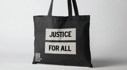
Today, we announced in an email to our subscribers that TLSC has a new look. We're excited to share these brand updates and why we made them.
We've updated our logo, typeface, colors, and imagery, including photography and illustrations. We've also polished our mission statement and fine-tuned how we present TLSC's services and work. We've unified our program offerings under client-oriented subcategories — making it easier to understand what kind of services we offer.
How We Got Here
Texas Legal Services Center is made up of multiple programs tailored for different legal issues, client-bases, and delivery methods. But with so many programs under one roof, over time we found that parts of the organization felt disjointed. For the sake of our clients and partners, we wanted TLSC to feel more unified and more identifiable.
Push10, a marketing firm specializing in brand strategy and identity design, has an annual pro bono initiative during the holidays called Unwrap a New Brand. They invite nonprofits nationwide to apply for a free branding package. TLSC applied, and we won!
We began working with Push10 in early 2020. They helped us find our voice and created a look that captures TLSC's spirit. We will be weaving the brand identity throughout all facets of TLSC.
Staying True to Ourselves
With this redesign, we set out to help our clients, ally organizations, and donors better understand TLSC's work. So we didn't lose our heritage in the process, we focused on capturing the essence of what TLSC has always been: professional and kind in our approach.
We champion justice, work with grave subject matters, and have a big, lofty mission. We wanted those who come across us to feel the weight and serious nature of our work. But we wanted to balance our seriousness with warmth so our clients always feel welcome.
We're excited to share a brand identity that unites our organization and helps ease some of the complexities of the legal landscape.


